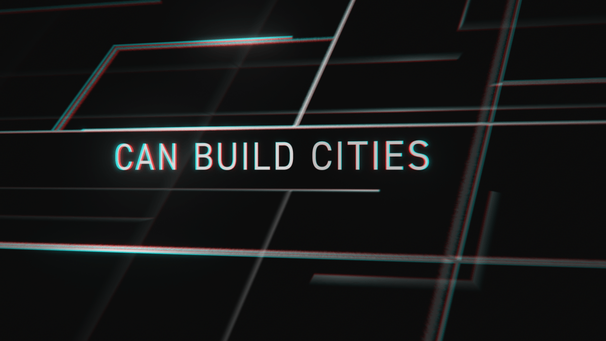
For this project, I wanted to aim for a dramatic, cinematic style of motion graphics to match the intensity of the soundtrack I selected, which was a quote from the film Inception.
I started with listening to the soundtrack on repeat while watching videos on mute from Vimeo, Pinterest and Behance, the styles of videos I liked the most for this project were the fast paced, glitchy videos with 3D elements. So that is the goal that I wanted to aim for this project, however I hadn’t used After Effects for a few years and had to essentially re-learn the software. I recorded 180~ hours on this project alone, majority of the time spent was on attempting to create a type of effect, compare it to the inspiration, analyse it and figure out why it was good or bad, followed by constant trial and error. Some effects I could easy learn through Youtube tutorials, such as some of the basic glitch effects, trim paths and how to use a camera, but a lot of other ideas I had in my head or from inspiration examples I either couldn’t verbalize the effect I was seeing to search for a tutorial, or there was no tutorial, so I had no choice but to spend a large amount of time on trial and error, which I think benefitted me a lot. There’s a concept that our head lecturer talked about which is Design Literacy, the ability to read design and assess whether its good or not, how to go about changing it, improving it, picking up on mistakes, etc. Similar to literacy in a language, I feel as though my design literacy skills greatly improved throughout the duration of this project. For example, the start of the project I was designing what I thought looked good and fit the soundtrack, as the project went on, I started questioning ‘Why?’ a lot more, as simple as it sounds. Anything I would do I would ask why, and through this process I think the ideas of my compositions had more thought into them and how the audience would think when they saw each composition, as opposed to the early compositions which were just using effects that I learned that I thought fit. As I learned more skills and became more comfortable with them, I was able to pick and choose what I wanted to use instead of just learning everything I wanted to learn and then just dumping effects into the project. It became less of “Create effect and use it” and more “I’ll use this effect for this reason”.
I used 3 plug-ins on this project, Video Copilot’s Saber, for some interesting lighting effects on some of the lines, I didn’t utilise this that much so I could have done without it. I used Video Copilot’s VC Orb to create a 3D model of the earth that I had freedom to animate, adjust bump map heights, textures, reflection maps, specular, etc. I wanted to be able to fully customise it and I couldn’t find a way to do this in After Effects effectively, I had done a similar thing with Cinema4D in the past but that would have been trickier to animate. I also used Magic Bullet Looks, for colour correction effects. Mostly for Chromatic Aberration effect and Spot Exposure and Colour Correction. I could have created these effects in After Effects, but effects such as Chromatic Aberration would take a pre-composition and several layers to create, which restricts the freedom of which I could use it and take a much longer time. Magic Bullet Looks mostly aided in giving more freedom and ease for colour correction/camera effects. It probably saved 20~ hours in time.
I didn’t like the audio mixing in the audio clip that was given to us, I thought it was choppy so I downloaded the audio from the trailer and mixed it in Adobe Audition. I’ve never used Audition before so the mixing still wasn’t great, and there was some errors in there I couldn’t find solutions for in the mix, so I disguised these with SFX in After Effects, but it ran better than the original mix given.
There are a lot of things I think I could have done better, but I’ll just mention the main points.
I would have scrapped the opening 4 seconds and redone them with the knowledge I know now, I created this sequence very early on in the project.
I also would have researched ways to better manage the size of the project. The project was over 100 layers in the master composition, 30~ pre-compositions with many layers, so it was becoming increasingly difficult to navigate through layers and the RAM Preview times were getting much longer, even in quarter quality. This is something I definitely I could have anticipated and looked into how to manage better. Nearing the end of the project, it was getting more and more difficult to watch complex previews such as the orb segment nearing the end. It would take 5-10 minutes to RAM Preview it in full quality. This definitely constrained the trial and error process.
I also should have had a more consistent thematic, nearing middle and later segments it was a lot more consistent, and I think I was approaching a better theme for the whole project which would have been good if it was consistent throughout. The early segments I think don’t match the rest of the project, so I tried to tie them in a bit more by having a similar theme for the ending segment.
Another big mistake I made was underestimating how much time and effort it would take to achieve the quality of the project I wanted, and I didn’t quite achieve that. I think I would have had to completely recreated the project with better project management to achieve that. It’s one thing to learn how to create an effect, it’s another thing to learn how to use it in an effective way that isn’t overbearing. It’s easier to add too much and end up overwhelming the viewer, than it is to know exactly what effects you should use for the desired outcome and not overdoing it.


