

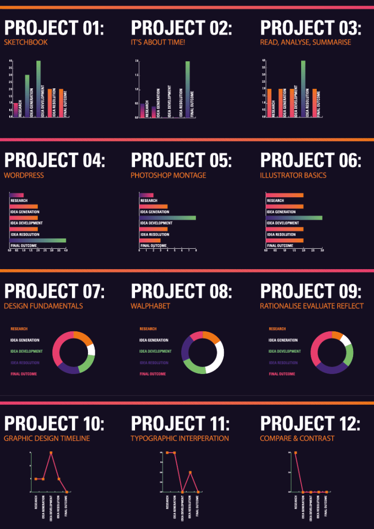


For the Information Graphics assignment, I wanted to aim for something which is relatively clean and simple, not over-complicating it. Focusing on enforcing the theme to keep it consistent and easy to read. I went for a dark background and neon colours with gradients as I thought this would stand out well on print. The colours weren’t as bright as I expected when I printed them, but I think the dark background helped them pop a little bit more.
I used very standard graphics and tried to make them a little bit more unique with a little twist on the key, so it was very easy to tell what kind of graph it is and how to read it, as people are generally most accustomed to bar charts, pie charts and line graphs. Though I think I should have tried to push that a little bit more to make them a little bit more unique.
For the composition, I wanted to have make almost like a leaflet folded 4 times, but have it folded horizontally instead just for a change similar to the approach for the graphs. Something that people are familiar with but with a little bit of a twist.
Overall, I usually try to attempt something more ambitious and different, but by doing so I often either shortly miss the standard I was trying to attempt, or spend an enormous amount of time trying to refine it to reach that level. This time I wanted to focus on refining my fundamentals as I think that will benefit me no matter how challenging or complex a task is, which can’t be said the other way around, learning more challenging and complex skills are usually not that time efficient and can’t be applied to a wide scope of projects, whilst solid, refined fundamentals can be applied to any project.
