
For the typographic interpretation assignment, we had to create work for laser-cutting, screenprint and risograph, this sets limitations on colour that can be used, gradients used and overall complexity of the work. I leaned towards working with a maximum of two/three colours, the first poster I used for all three mediums of printing as it has the simplest shapes and colours to work with, just black and white type with a couple rectangles.
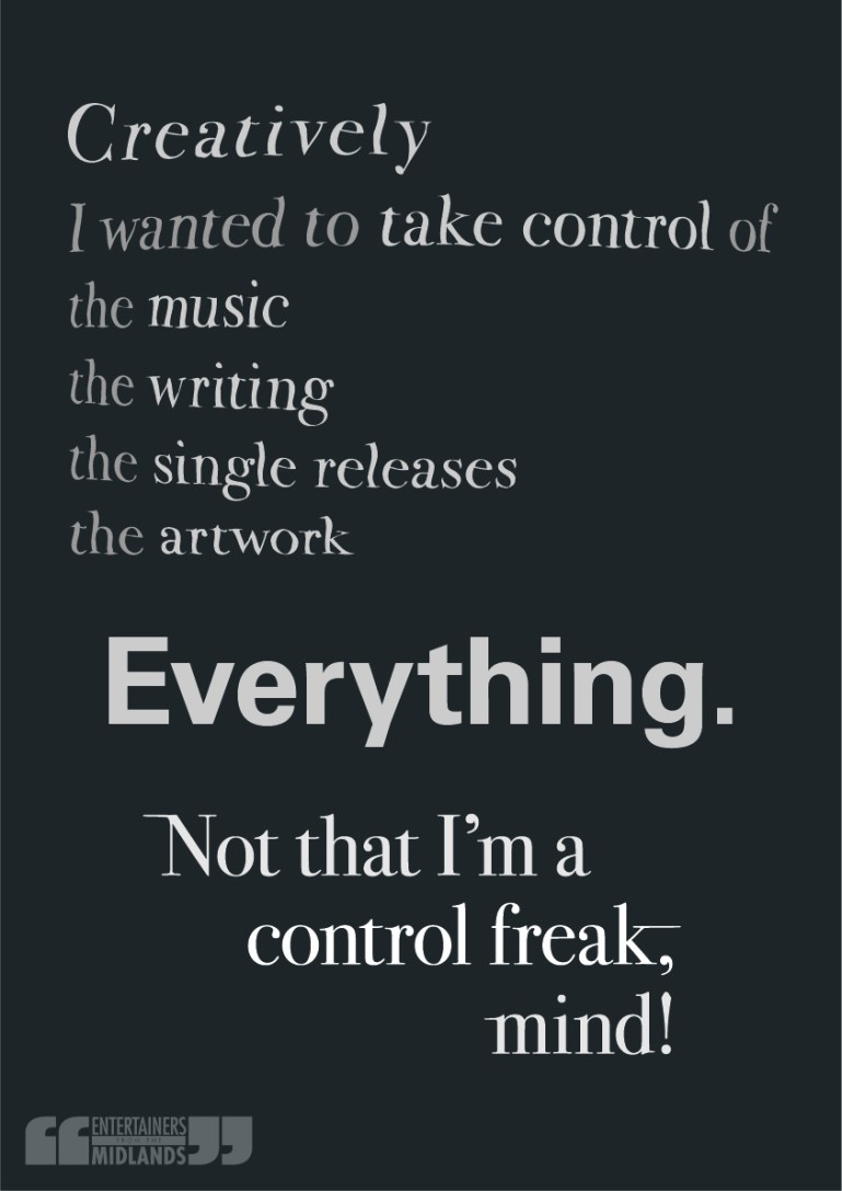
I’m overall quite happy with the first poster as I think it reads well, I used rectangles and blocks of text to allow the type to flow in a specific direction and try to limit possible other ways of reading it, to avoid confusion. I generally like the mix of different weights used for contrast, I thought of a lot of the type more as blocks of importance, similar to if you were to squint at it, the more important aspects of the poster would show through, though I think I failed somewhat in that regard to the type that says “Control Freak”. My idea was to use no fill and a relatively thin stroke to outline the type, and this was used to create an almost-illuminating effect. I wanted the poster to feel as though there was different lighting in different aspects of the poster, similarly to if there was a room that has varied levels of lighting, it draws your attention to certain aspects of type to emphasize that and create a somewhat sinister feeling. In terms of technical aspects of the poster, I think I could have managed the leading on the final sentence better, it creates an awkward space that doesn’t feel too great as negative space, so I think it would have been better if I had wider leading and the type to hug the negative space of the logo a little bit better. I also think the ‘Everything’ could have been more impactful as a condensed weight and a larger point-size. Due it to being vertical type, it feels quite thin with the space around it. I also think the position/size of the word ‘Of’ could have been better managed, I didn’t align it with the rectangle as I thought it created a weird negative space shape around the ‘single releases’ type, as if that type couldn’t breath. So I decided on this point-size and placement to create a nice even amount of negative space around the smaller, lighter type.
For the second poster, I wanted to create a poster that felt as though it was progressively turning more sinister or deranged, and at the word ‘Everything’ all the type would snap into an organised grid-format, with cleaner type. I then extended the serifs on the N and K to give a feeling of planning and structure, and to really separate the 1st line from the 2nd line. I used a Serif typeface for the last phrase as I thought it would feel slightly more cordial, I didn’t want the end of the quote to feel too sinister, I wanted it to feel structured, serious but not malevolent or deranged. As if the poster begins and descends into madness and then snaps into order at the concept of control. I chose the colour scheme of a very low saturated dark navy for the background with different shades of light grey for the type, in order to create an ethereal feeling. In order to improve this poster, I would have started the poster in a more controlled manner, less distortion initially and it progressively becomes more distorted. I also would have increased the contrast between some of the different shades of grey in order to create less confusion for the audience as to if some text is differentiated or not.
For the third poster, I wanted to aim for something very orderly and controlled, and then have an aspect of disorder, almost like a less dramatic reverse of the 2nd poster. With some red aspects to give a sense of urgency. I like the first 3 lines of type. I think it’s well structured and spaced, but I dislike the spacing between the first 3 lines and the next part of the poster, there’s not enough negative space there, I feel as though it should breath a little bit more, and perhaps using the ‘of’ in a different position as a transition between the first three lines and the remainder of the quote. Other than the space around it, i like the second ‘list’ part of the poster, though maybe I should have increased the weight of the ‘of’ to create a link between the first 3 lines and also to create a little bit more contrast between the ‘of’ and the list part, I also think maybe there should be a little bit more space between the red line and the type on either side. I like the ‘everything’ part, I used uppercase and wide kerning to create a bar-like effect to create a separation between the first half of the poster and the second half, though i think it would benefit from more space between the ‘everything’ and the list aspect of the poster. I generally like the ‘not that i’m a control freak, mind!’ aspect of the poster, only thing that I may want to change would be the red explanation mark, I think it may just look better as black, but other than that I think that part is okay.
As far as the quote itself goes, I know that the quote is jovial and not sinister in any way. However I think it’s very difficult to both capture the original intent of the quote, and to make a compelling design. So I opted to somewhat alter the quote’s interpretation depending on the poster, and I do think that it made the overall design of all three of the posters far more compelling.
