

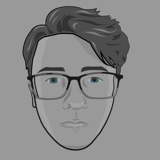
Here is my Illustrator self-portrait, I tried to go for an almost sketching-style for the shading and definition of soft shapes like the nose, lips etc. Shapes that don’t tend to work too well with solid shapes. I also varied the strike lines to give the impression of imperfections that you would get if you’d outline roughly with a fineliner.
Things I would try to do better next time would be I’d get more accurate shading on the lips, lips are very hard to illustrate with vectors as too solid of shapes can look like lipstick. So it ends up looking like I’m in a bad moon which isn’t what I intended, especially around the top lip.
I would also re-do the eyes and perhaps not colourize them, I thought it would contrast well with the greyscale but it ended up looking like a strange mish-mash of styles.
I’d also use the same diagonal line pattern to shade parts of the eyebrows as it looks as if I have drawn-on eyebrows. I also could have used this on the hair for the highlights and layers, it again looks as if it’s a weird mish-mash of styles.
I also would have used more contrast with the shading. I thought it would be too harsh if I had everything at 100% opacity but it’s ended up looking too soft when scaled down in a small avatar.

Here’s the basic tutorials I recreated.
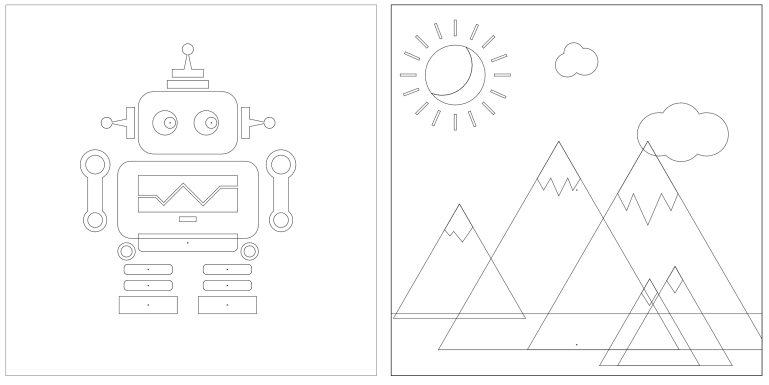
Here are the the illustrations in outline mode.
